A strong coalition
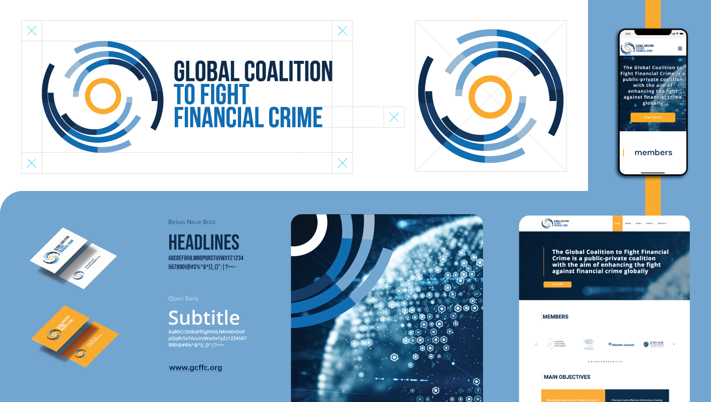
The logo design is based on a structured geometric approach, created through the subtraction of four axes from four concentric circles of equal thickness. This process results in a series of arcs, strategically fragmented into multiple points and oriented inward to create a sense of focus and cohesion. At the center, an additional circle has been incorporated, symbolizing a coin, reinforcing the theme of financial systems and the coalition’s mission. The overall composition conveys precision, structure, and interconnectedness, reflecting coalition’s role in unifying efforts against financial crime.
Task
The developed visual identity strengthens GCFFC’s presence, promoting clearer communication and facilitating collaboration between key stakeholders in the fight against financial crime.