Brake better, drive safer
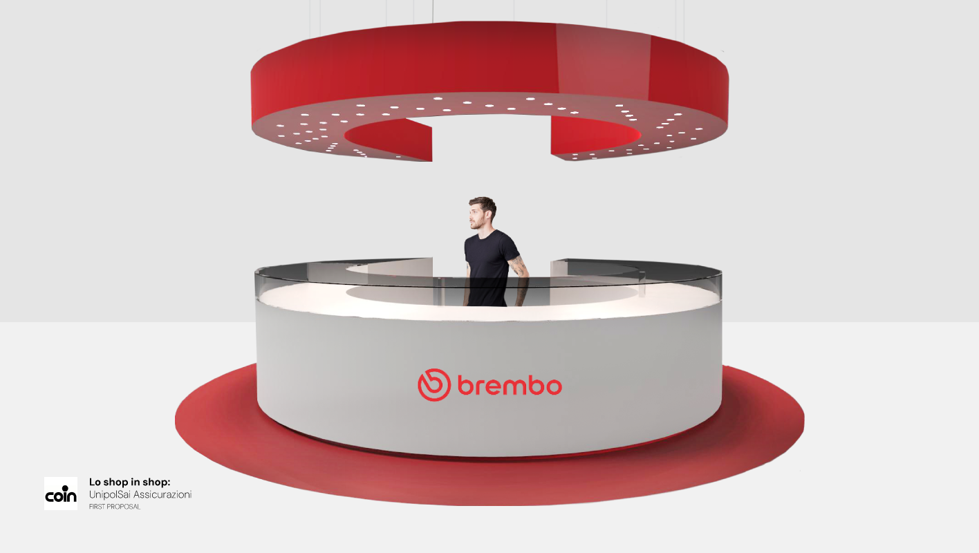
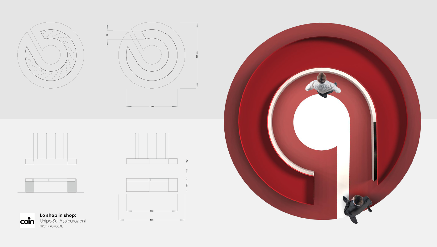
The design echoes the structure of the Brembo logo, with a single open side that forms a striking entrance at the corner of the store. Inspired by the logo’s distinctive double ring, one ring is reimagined as an integrated lighting system suspended above, while the other is transformed into a circular desk. Each element of the stand pays homage to Brembo’s bold red identity. Complementary glass components have been added to create a light and airy feel, ensuring that the dynamic perspective of the logo’s shape remains the focal point.
Task
Designing a functional and visually compelling stand that maximised a limited 20 square meter space while meeting the challenge of full 360 degree visibility within the store environment.